One minute.
That’s about how long most investors spend scanning a pitch deck before deciding whether a conversation is worth continuing.
The pitch deck examples in this article didn’t stand out because they were flashy or overly-designed. They worked because they told clear stories, framed believable opportunities, and made complex ideas feel simple.
Below are ten widely referenced pitch deck examples from category-defining startups, broken down to show why investors leaned in and the lessons founders can apply when building their own decks today.
The Airbnb deck told a story anyone could follow.
It started with a familiar frustration: expensive hotels and unused living spaces, then introduced a simple, human solution. Each slide focused on one idea. No clutter. No competing messages.
By the time the deck introduced market size, investors already understood the problem and believed it was worth solving.
Clarity did the heavy lifting.
Strong pitch decks don’t overwhelm. They guide.
Uber’s deck demonstrated a deep understanding of the entire ecosystem, not just riders, but drivers too.
The narrative made it clear that this wasn’t just a transportation idea; it was a scalable platform with city-by-city expansion potential. Financials supported the story instead of competing with it.
The result was confidence, not complexity.
Clarity plus competence beats ambition alone.
Dropbox anchored its entire story on a question everyone could relate to: “Where did I put that file?”
Instead of leaning into technical explanations, the deck painted a picture of a simpler future where files followed users across devices effortlessly.
The absence of jargon made the idea feel inevitable.
Simplicity doesn’t weaken a pitch; it strengthens belief.
At Toast Creative Studios, we help founders distil complex ideas into simple, persuasive narratives investors can grasp quickly.
Stripe’s deck knew exactly who it was for.
The language, examples, and framing spoke clearly to developers, while still signalling a massive market opportunity to investors. It demonstrated product–market fit without overcomplicating the message.
Focus created credibility.
Just make sure every technical detail ultimately ladders up to a larger, understandable opportunity.
Snapchat’s deck was minimal and precise.
It clearly defined its audience and showed early engagement that proved users genuinely loved the product. There was no attempt to appeal to everyone, and that restraint worked.
Engagement and behaviour matter more than feature lists.
Robinhood’s deck made timing central to the story.
It clearly defined an underserved audience and explained why traditional players couldn’t meet their needs. Broader market trends reinforced why the moment was right.
The opportunity felt inevitable, not speculative.
At Toast Creative Studios, we help founders clarify who their product is for, and who it’s not for, to build stronger decks and stronger businesses.
Peloton balanced emotion with evidence.
The deck showed how connected fitness could change people’s lives, then grounded that vision in subscriptions, hardware sales, and recurring revenue.
Belief was supported by structure.
Canva’s deck was straightforward and confident.
It demonstrated growth potential, a clear path to revenue, and a product designed to scale globally. The visuals reinforced the story without overpowering it.
Everything felt intentional.
Confidence comes from coherence.
Facebook’s deck revealed a shift in behaviour rather than introducing new technology.
It showed how people already wanted to express identity, maintain real relationships, and form communities online, and why existing platforms fell short.
Rapid user adoption and strong network effects made growth feel natural. Investors weren’t just seeing a product; they were seeing a new social layer of the internet taking shape.
Growth is more compelling when it feels organic, not forced.
YouTube framed video sharing as a distribution problem, not a content one.
The deck showed how difficult it was to publish and discover video online, then positioned YouTube as a simple, scalable alternative built around users.
By focusing on ease, sharing, and creator participation, the future of video felt user-led and inevitable.
The strongest pitch decks make change feel obvious, not speculative.
The pitch deck examples above share common traits: clear positioning, focused storytelling, and restraint. They respect the investor’s time and guide attention deliberately. They make it easy for investors to understand:
That’s not a design achievement. It’s a thinking one.
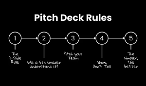
We wrote more about this in our article – 5 essential rules to create a winning pitch deck in 2026
Toast Creative Studios works with founders to shape pitch decks that communicate clarity, confidence, and conviction.