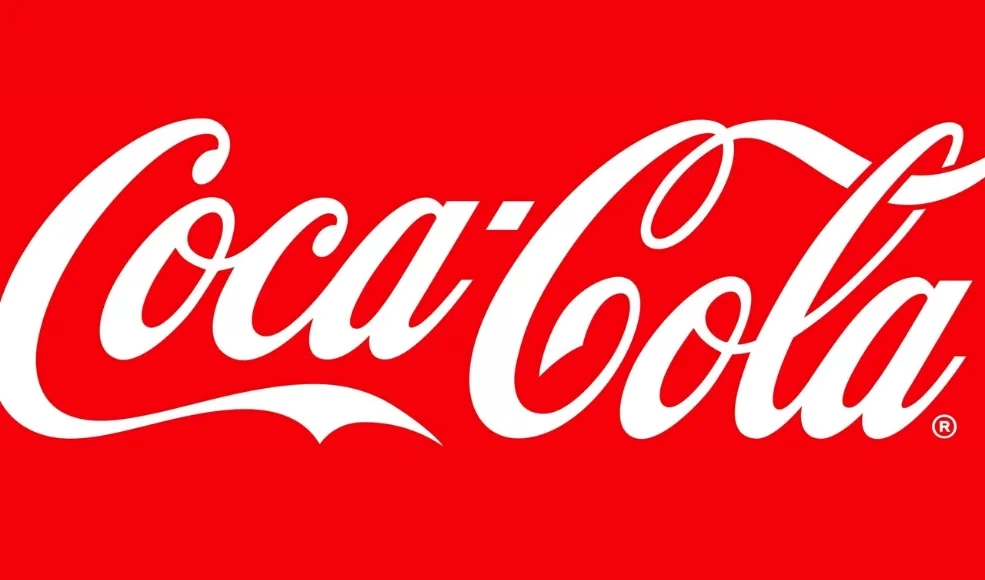
Coca-Cola’s brand guidelines are a lesson in how to keep it classic while staying fresh.
With its signature red, iconic typography, and that famous logo, Coke nails brand consistency every time.
Their guidelines are a deep dive into how they do it. We especially love how they visually and verbally translate the Coca-Cola logo in international markets.
Check that out and more in their guidelines below.
Netflix’s brand guidelines are as bold and dynamic as their content lineup.
From their striking red and black color scheme to their clean typography and cinematic imagery, everything is crafted to create an unforgettable experience.
Check out the Netflix brand microsite to learn how they keep audiences hooked!
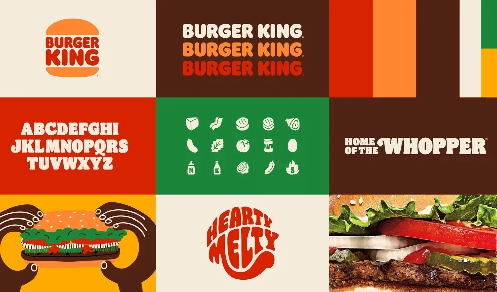
Burger King rebranded for the first time in 20 years in 2021 and their brand guidelines are a feast for the eyes!
With a retro-inspired look, mouth-watering colors, and playful typography, they’ve cooked up a brand identity that’s as bold as their Whopper.
Their guidelines show us how to mix personality with consistency, from the iconic logo to quirky illustrations that keep things fresh and fun.
Download it below
You’re in luck! At Toast Creative Studios, we have over a decade of experience in branding and much more. Get in touch with us today!
Spotify’s brand guidelines hit all the right notes!
With its vibrant color palette, bold typography, and fluid use of imagery, Spotify creates a visual identity that’s as dynamic as its music catalog.
They’re all about flexibility, encouraging creativity while maintaining a cohesive look across every platform. Whether it’s album art or playlist graphics, their guidelines ensure the brand stays in perfect harmony.
Check out their brand micro-site below.
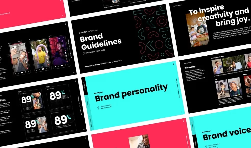
TikTok’s brand guidelines are as energetic and engaging as their content!
With a sleek black backdrop, neon accents, and a playful logo, TikTok captures the vibe of a global community that’s always on-trend.
Their guidelines emphasize creativity and movement, ensuring the brand stays fresh, fun, and instantly recognizable.
Check out TikTok’s microsite below to learn how they achieved this.
Duolingo’s brand guidelines are as lively and friendly as their mascot, Duo the Owl!
With a bright color palette, playful fonts, and cheeky illustrations, Duolingo brings a sense of fun to every touchpoint.
Their guidelines highlight the power of simplicity and humor in creating a brand that makes learning feel like a game.
We love their brand micro-site, check it out below.
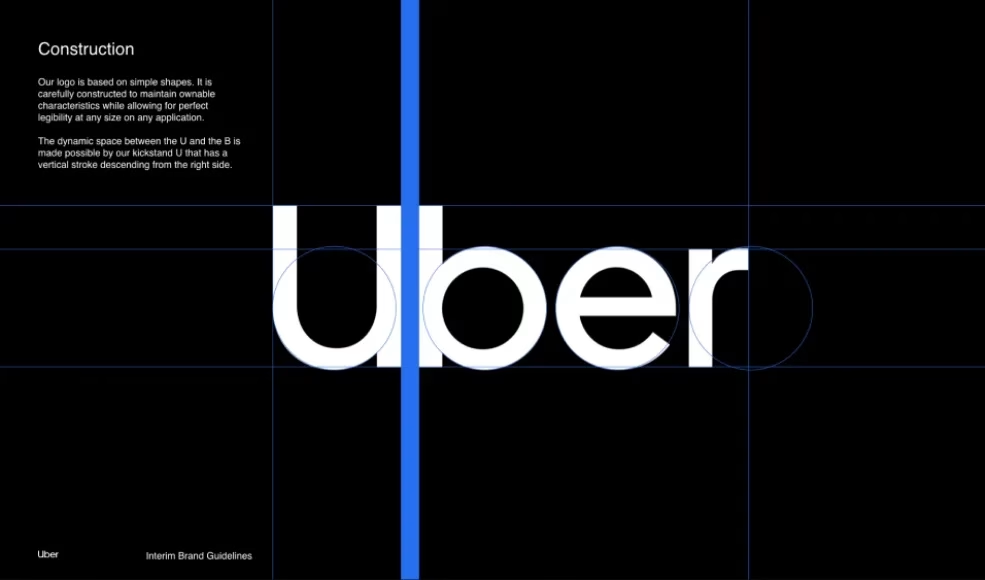
Uber’s brand guidelines are all about simplicity and sophistication.
With a clean black and white color scheme, modern typography, and minimalistic design elements, Uber reflects a brand that’s smooth, reliable, and always moving forward.
Their guidelines emphasize clarity and ease of use, ensuring every interaction feels effortless.
Check out their detailed breakdown of their brand elements on their microsite below.
Hulu’s big green guide is as fresh and vibrant as the shows they stream!
With a signature green hue, crisp typography, and engaging visuals, Hulu creates a brand that feels fun, lively and inviting.
Their guidelines focus on a playful yet clean design, balancing fun with a user-friendly experience that keeps viewers coming back for more.
Curious about how they bring the entertainment factor to their branding? Check out their micro-site below
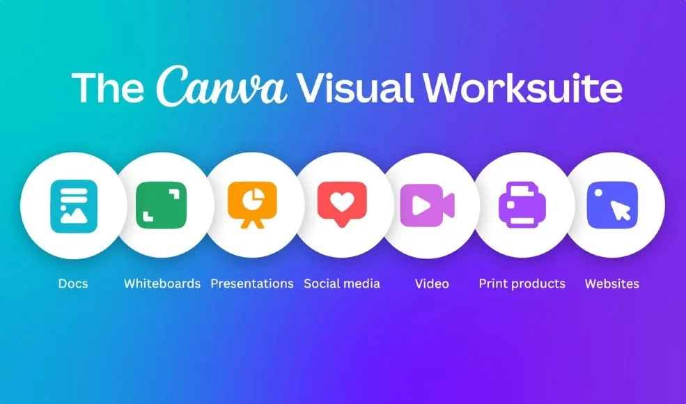
Canva’s brand guidelines are all about empowering creativity for everyone, everywhere.
With a bright, diverse color palette, approachable fonts, and a clean, intuitive layout, Canva embodies a brand that’s fun, fresh, and accessible.
Their guidelines encourage flexibility and imagination while maintaining a cohesive look that makes design easy and enjoyable.
Ready to see how Canva keeps creativity flowing? Check out their micro-site below
Need brand guidelines ?
You’re in luck! At Toast Creative Studios, we have over a decade of experience in branding and much more. Get in touch with us today!
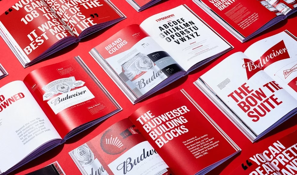
Budweiser has existed since 1876 and their most recent brand guidelines published in 2021 are a tribute to tradition and timeless style.
With its classic red and white color scheme, bold typography, and iconic logo, Budweiser maintains a brand identity that’s both premium and instantly recognizable.
Their guidelines emphasize heritage and consistency, ensuring every touchpoint feels authentically Budweiser. Check it out below
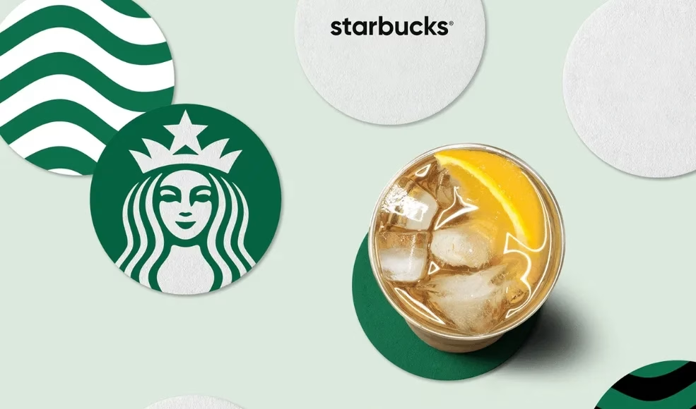
Starbucks’ brand guidelines focus on consistency and quality, ensuring that every cup and experience reflects their commitment to excellence.
With a signature green, elegant typography, and the iconic siren logo, Starbucks crafts a brand identity that’s warm and universally recognizable.
Ready to see how they keep their brand brewing strong? Check out their awesome brand micro-site below.
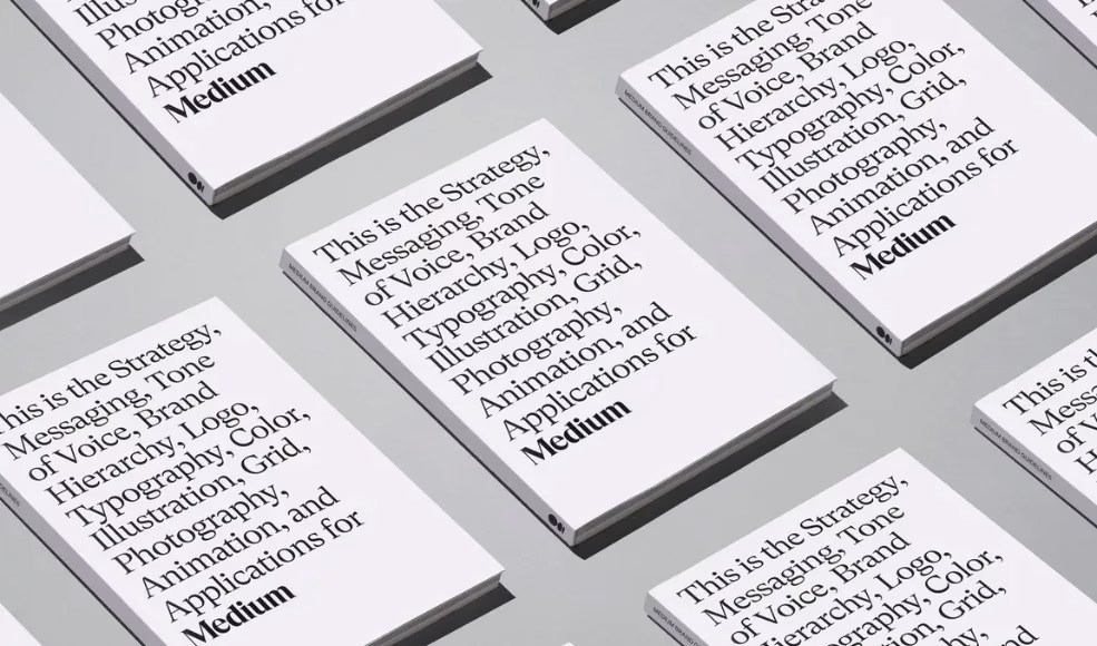
First of all, give it up for Medium’s brand guidelines cover.👋🏿👋🏿👋🏿
With a minimalist design, subtle color palette, and crisp typography, Medium emphasizes clarity and sophistication. Their guidelines focus on creating a space that’s both inviting and intellectually engaging, ensuring every article stands out in a clean, readable format.
Want to explore how they craft a compelling reading experience? Check out their design micro-site below.
Conclusion
Building a strong brand takes effort, but well-defined brand guidelines help streamline the process and ensures consistency.
We hope this post has set you on the right path or has at least caused you to geek out over some awesome brand guidelines.
If yes, leave us a comment telling us all about your favorite guidelines.
