Have you ever been stopped because you were carrying a laptop?
Or looked at sideways because you said you work in the Arts?
For too many creatives in this part of the world, that’s not a hypothetical. It’s Tuesday.
Our client wanted to change the story.
A world where DJs, designers, filmmakers, photographers and artists aren’t treated like they’re doing something unserious, suspicious or “just for fun.”
A world where creativity is recognised as a career, respected as a profession and celebrated as a force for change.
So we set out to build more than a brand.
We built an institution.
The Office of the Creative.
Because creativity deserves an office too.
Info
Client:
Office Of The Creative
Services:
Creative Direction
Brand Strategy
Motion Graphics
Marketing Assets
Social Media
Contributors:
Jide Awulonu
Sylvester Omotunde
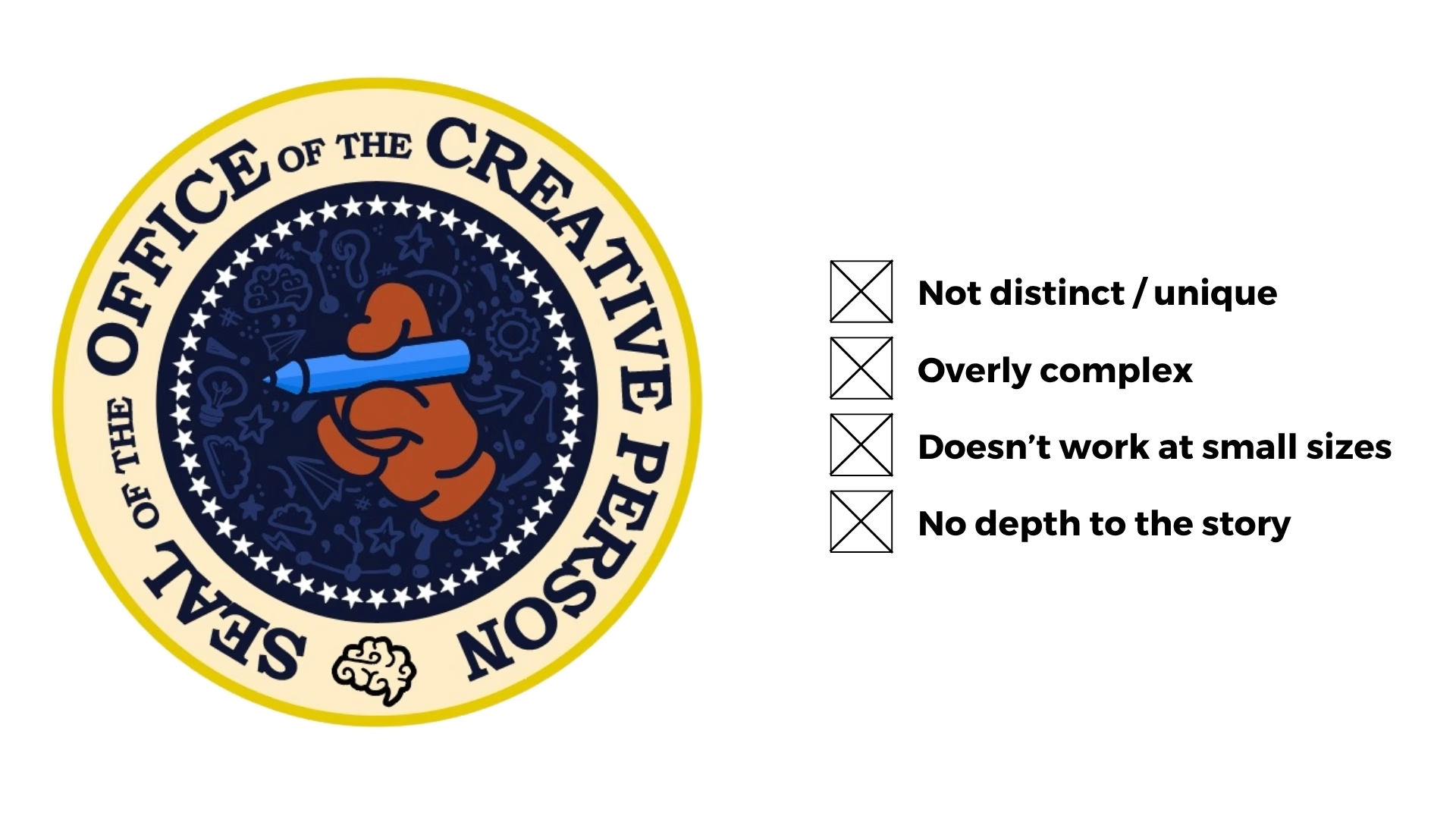
Old Logo
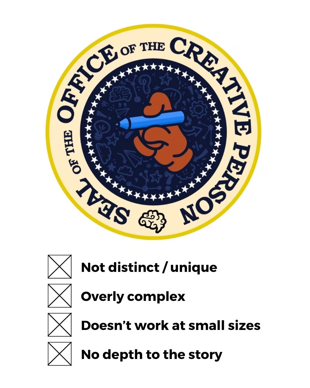
Old Logo
The Challenge: Giving Creativity a New Face
Office of the Creative had an identity, but its visual language wasn’t yet carrying the weight of its ambition.
It felt busy, was hard to recognise at smaller sizes, and didn’t quite have the distinction or authority needed for an institution with bigger ambitions.
The idea was powerful. The identity just needed to catch up.
Our Approach: From Vague to Precise
Creativity is vast. Trying to capture all of it in one single element felt, well, almost impossible.
The old logo took the obvious route: represent creativity with every creative tool. A brain. A light bulb. A paper plane. A star. A pen. Even a gear.
We wanted to find something simpler. Something smarter. Something that didn’t need six symbols to say one thing.
Then came the light bulb moment.
We remembered a random Instagram video from months ago showing the visual representation of Pi (π). An endlessly expanding symbol where the beginning and end never meet.
It was the perfect metaphor because creativity works the same way.
One idea leads to another, and to an even better one.
The creative process never ends
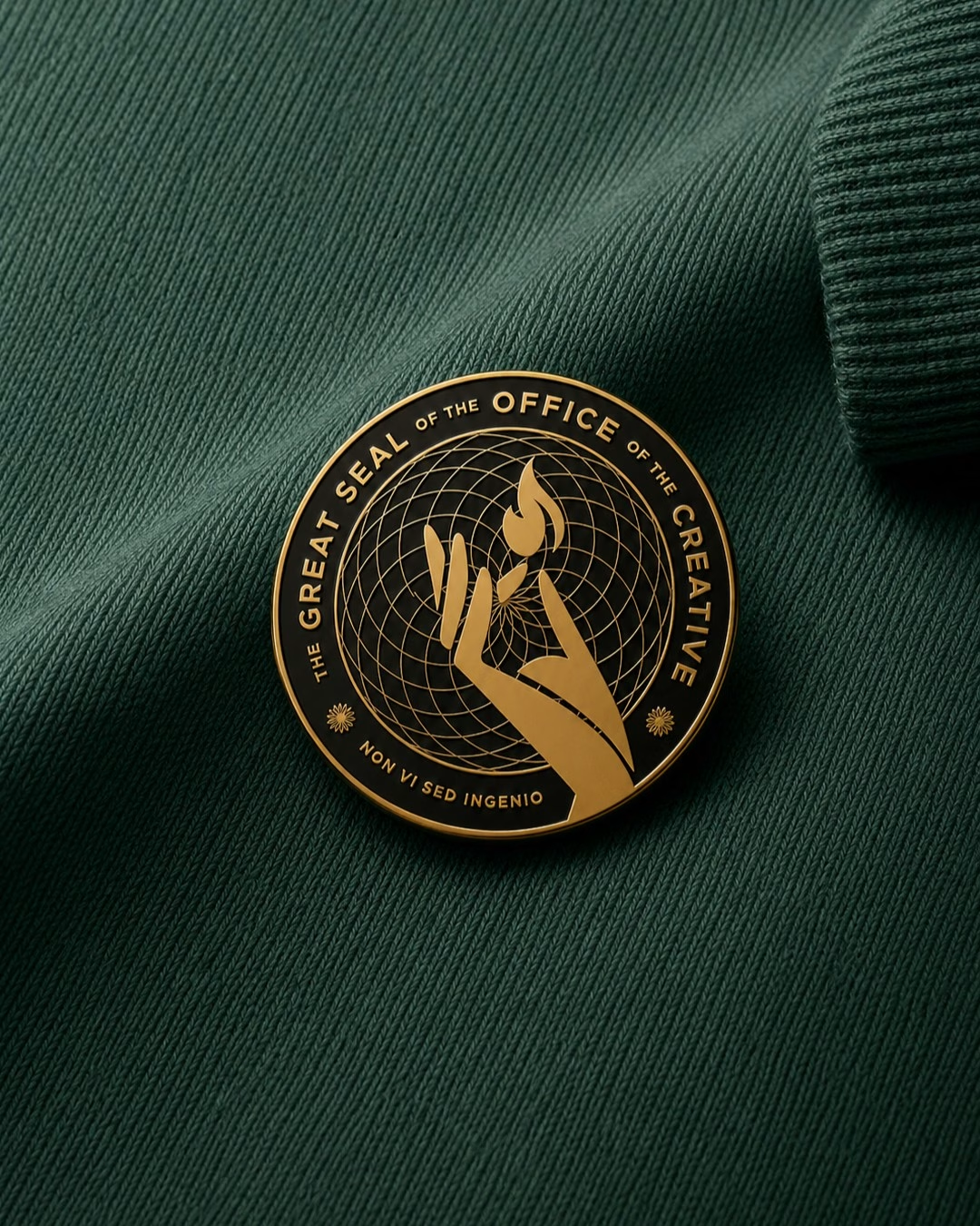
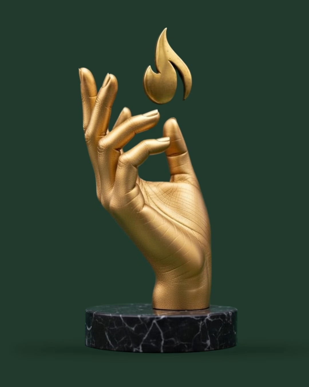
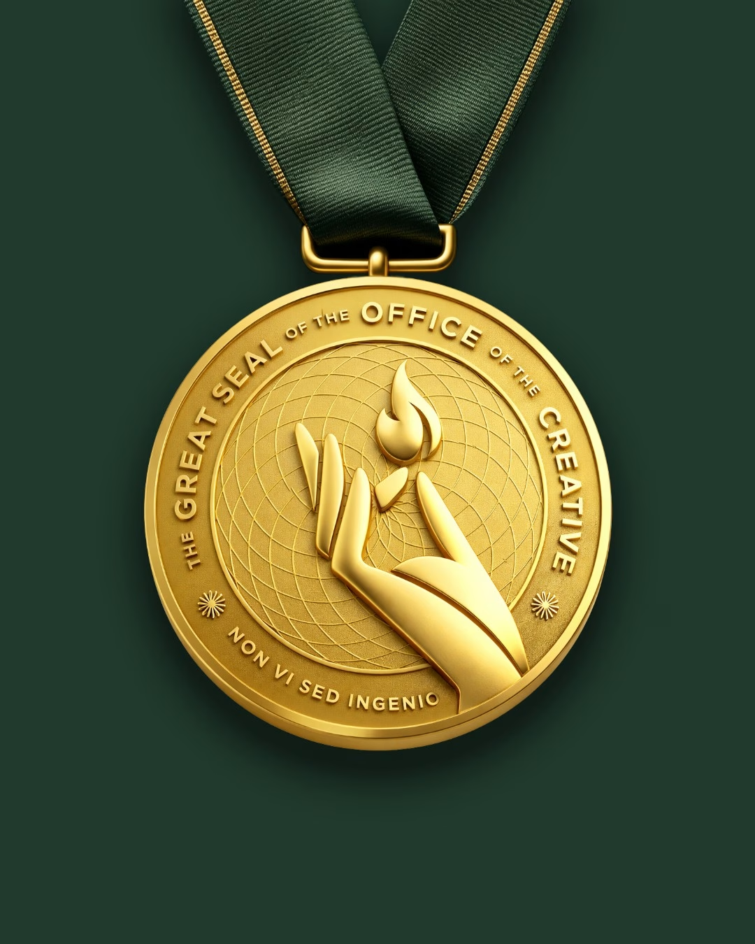
The Hand and Flame: We chose the hand because every great idea needs a human hand to bring it to life.
To represent creativity itself, we chose the element of fire.
The hand holding the flame reminds us that creativity is powerful, and must be handled with care.
A subtle reminder to create boldly, create responsibly
The Final Touch: The Slogan
A great institution needs a great motto.
And our research showed us that Latin phrases carry the governmental aura we were looking for.
“NON VI SED INGENIO”
It translates to “Not by Power, but by Creativity.”
And just like that, the puzzle was complete.
A bold identity. A powerful idea. And a touch of meaningful Latin to bring this great institution to life.
The Outcome: A symbol worthy of the vision
Bringing it all together, we created a visual system that instills the authority of official institutions, while keeping creativity at its very core.
Our output included:
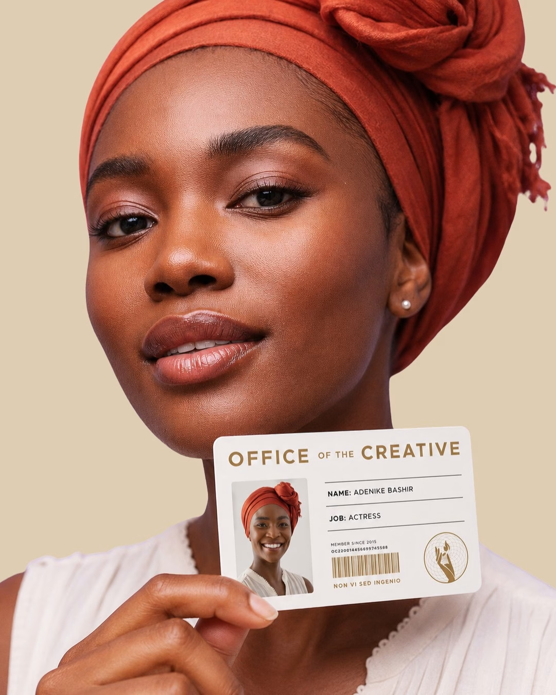
Identity cards every creative would be very happy to show off.
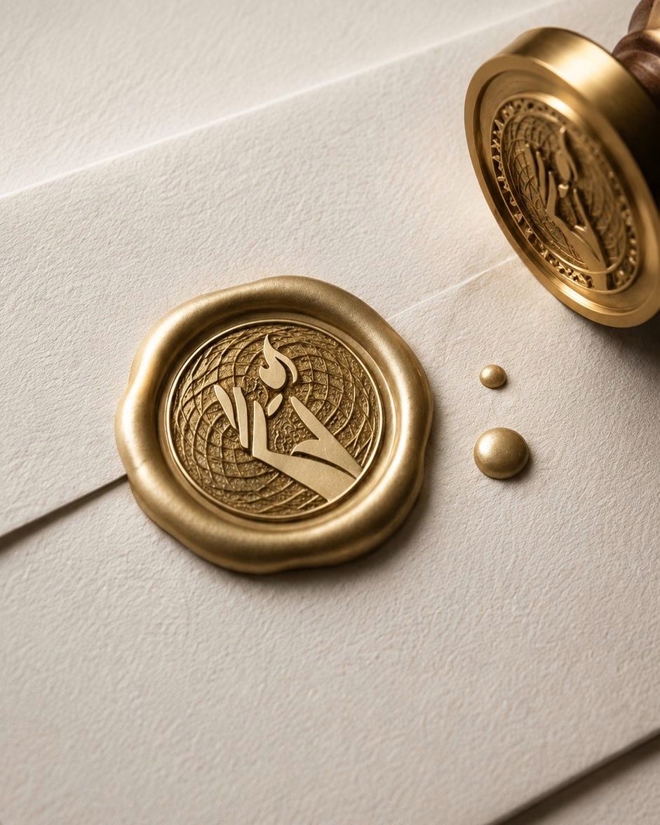
Stationery that carried a sense of authority, from letterheads to wax-sealed envelopes.
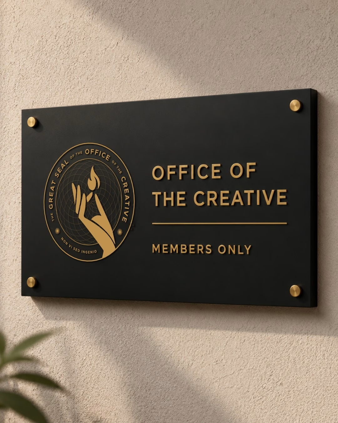
Indoor and outdoor signage that made the Office impossible to miss.
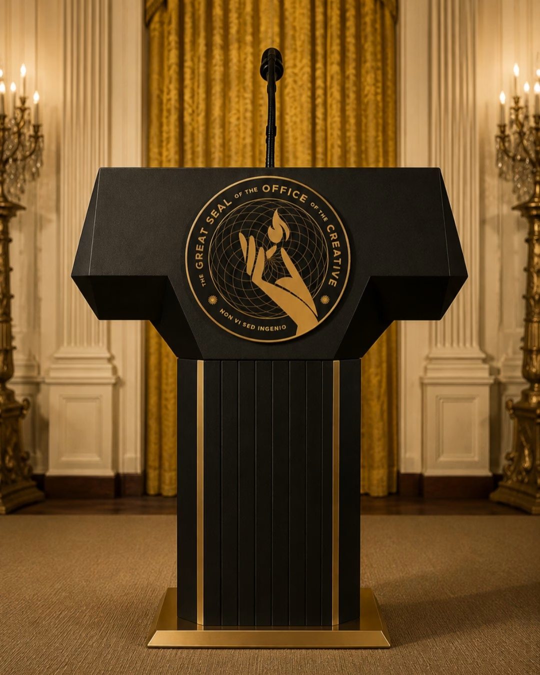
A podium fit for the President of the Creatives.
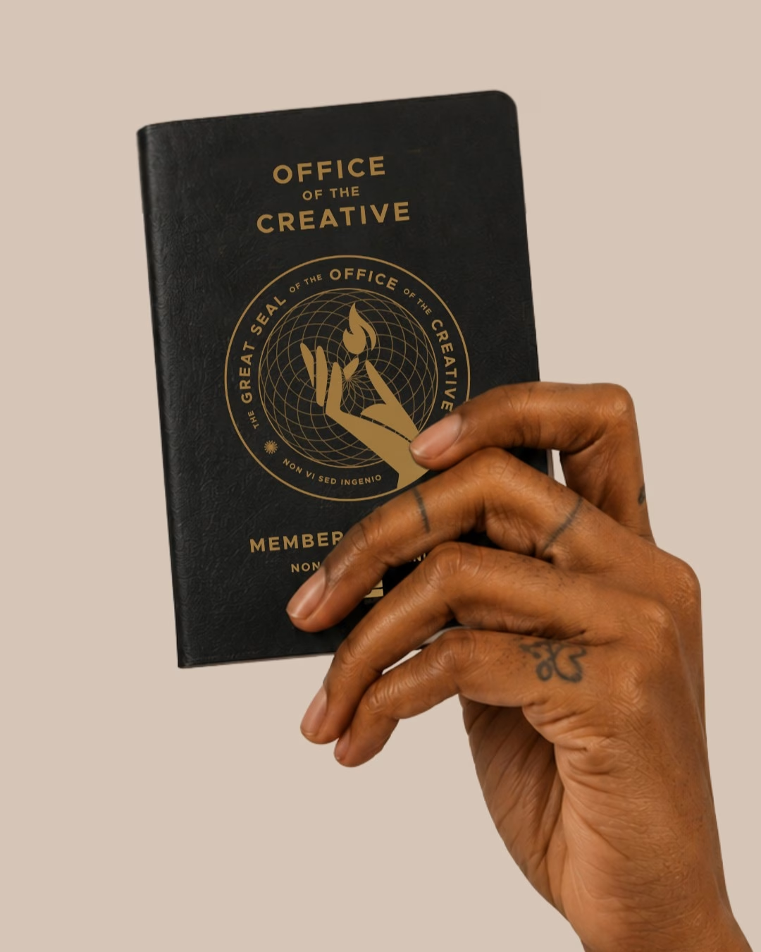
Award plaques, lapel pins, passports and medals that made every creative feel like they belonged.
Lapel Pin
Wax Seal
ID Card
Award Plaque
Winners Medal
Member Passport
Wayfinding Signage
Speakers Podium
Want to work with us?
Are you a kind, accessible founder building something that truly matters? Is your business making the world a better place? Then we want to work with you too!