Bad logos are everywhere, and it’s usually because most brands and business owners decide on logos based on aesthetics alone.
A logo can look really nice but still end up being a bad logo.
Aesthetics is just a small fragment of the whole picture when it comes to creating a logo for your brand or business, but when you think otherwise, that misconception is actually the genesis of the problem.
Written by Amanda Benson | Edited by Jide Awulonu
Your logo shows up everywhere your business does: on your website, social media, packaging, documents, and mobile apps.
So, if it isn’t doing the one job it’s actually meant to do, it might be doing more harm to your brand than you realise.
Before we dive in, if you’d like a deeper understanding of what a logo actually is, what it does, and what it isn’t meant to do, read our article titled “What Is a Logo?“ first.
It’ll give you the perfect foundation for everything we’ll cover below.
With that in mind, here are six signs your logo might be hurting your brand:
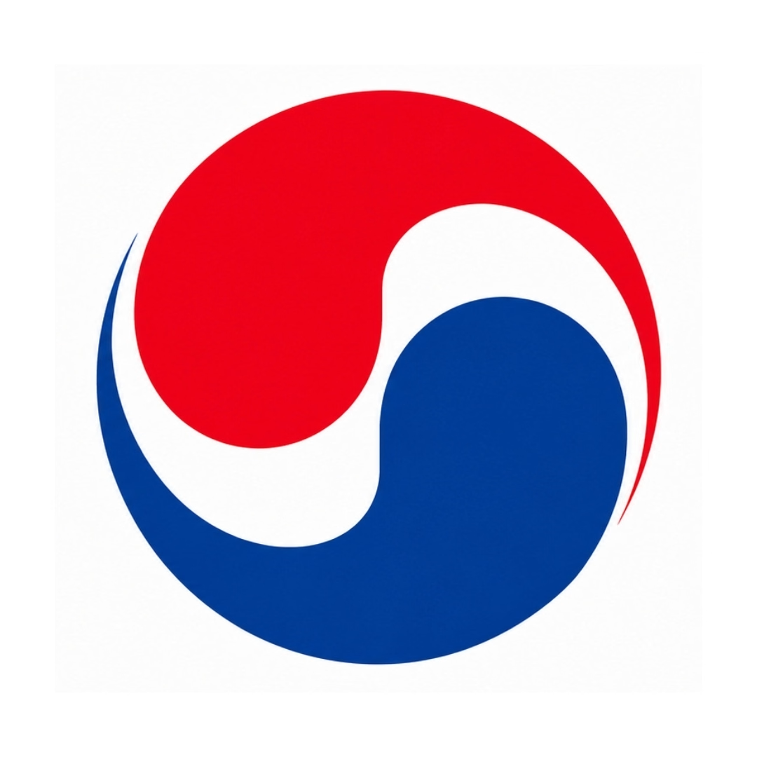
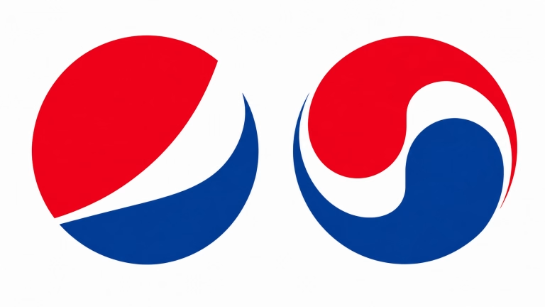
Take a look at this logo.
What does it remind you of?
Pepsi, right?
Wrong!
This is the old Korean Air logo and it’s very easy to confuse it with Pepsi’s mark, and for decades people mixed the two up.
So every time someone glanced at that logo and thought “oh, Pepsi,” Korean Air was handing its brand recognition to a soft drink company for free.
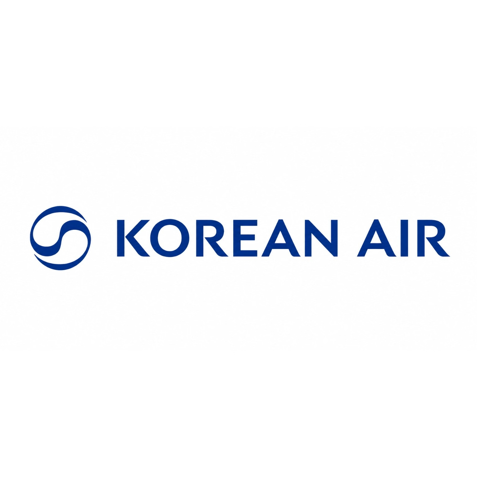
Compare that to their logo today.
There's no mistaking it for anyone else anymore. it clearly belongs to Korean Air.
That's the risk when your logo is too generic, too complicated, or looks like everyone else's in your industry.
As a result, people see it without ever really registering it as yours.
Ultimately, a good logo doesn't need to be complicated or clever. It just needs to be simple and distinct enough that people can place it after a few encounters and know, without a doubt, that it is you.
So if people don't recognize your brand through your logo, it becomes harder to build the kind of familiarity and trust that keeps them coming back.
At Toast Creative Studios, we create logos that will help your business stand out, stay memorable, and build trust from the very first impression.
The one constant thing in life is change. Trends change. Design language evolves. Fonts, colours, styles, and layouts. Even when nothing about your business has changed at all.
Your product can stay exactly the same. Your customers can stay exactly the same. But the world around your logo keeps moving, and if your logo doesn’t move with it, it starts to feel old.
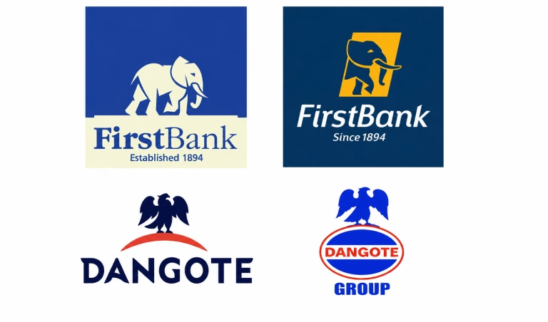
For example, look at The First Bank logo and The Dangote logo. Which do you think is the current logo? Which one is the old one?
Notice that the elephant is still an elephant, and the eagle is still an eagle. What changed is what “current” looks like, and both brands kept up with it.
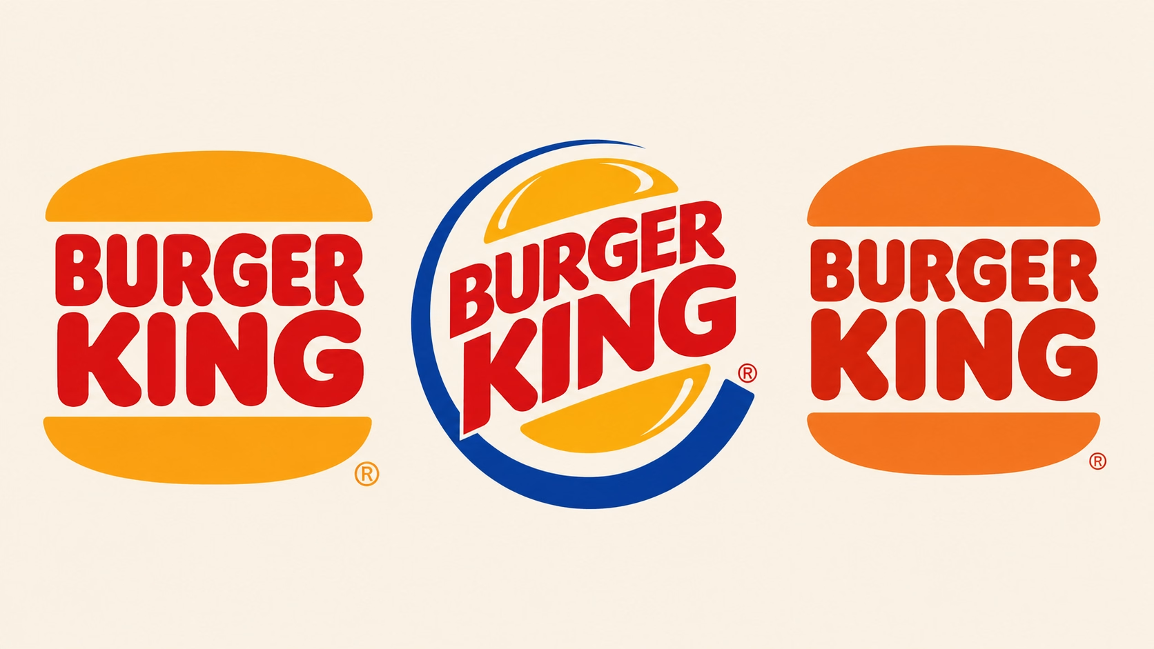
Similarly for Burger King, the middle logo was the “current” version for over 20 years. But in 2021, Burger King went back to something close to their 1969 look. Not because the old one had aged badly. It just needed sharper lines, better proportions, a cleaner finish. The same idea, but rebuilt for today.
A logo updated on purpose, even one that leans backward, looks intentional. A logo left alone just looks forgotten. That’s the difference between vintage and outdated. You can usually tell them apart the same way you can tell a styled vintage outfit from someone who just never updated their wardrobe.
What doesn’t work is leaving a logo completely untouched and assuming it’s fine because the business hasn’t changed.
It might not need a new meaning. But it still needs a new feel. And that gap between the two is exactly what makes a logo look outdated.
An outdated logo costs you quietly. It can make a good product look behind the times, make premium prices harder to justify, and makes new customers hesitate to trust a brand that looks like it stopped caring about itself.
Your logo should work wherever your brand needs to show up. Your website, Instagram, WhatsApp, a presentation, a billboard, or a tiny phone screen.
Simply put, if your logo only looks good at one size or in one format, that’s a problem.
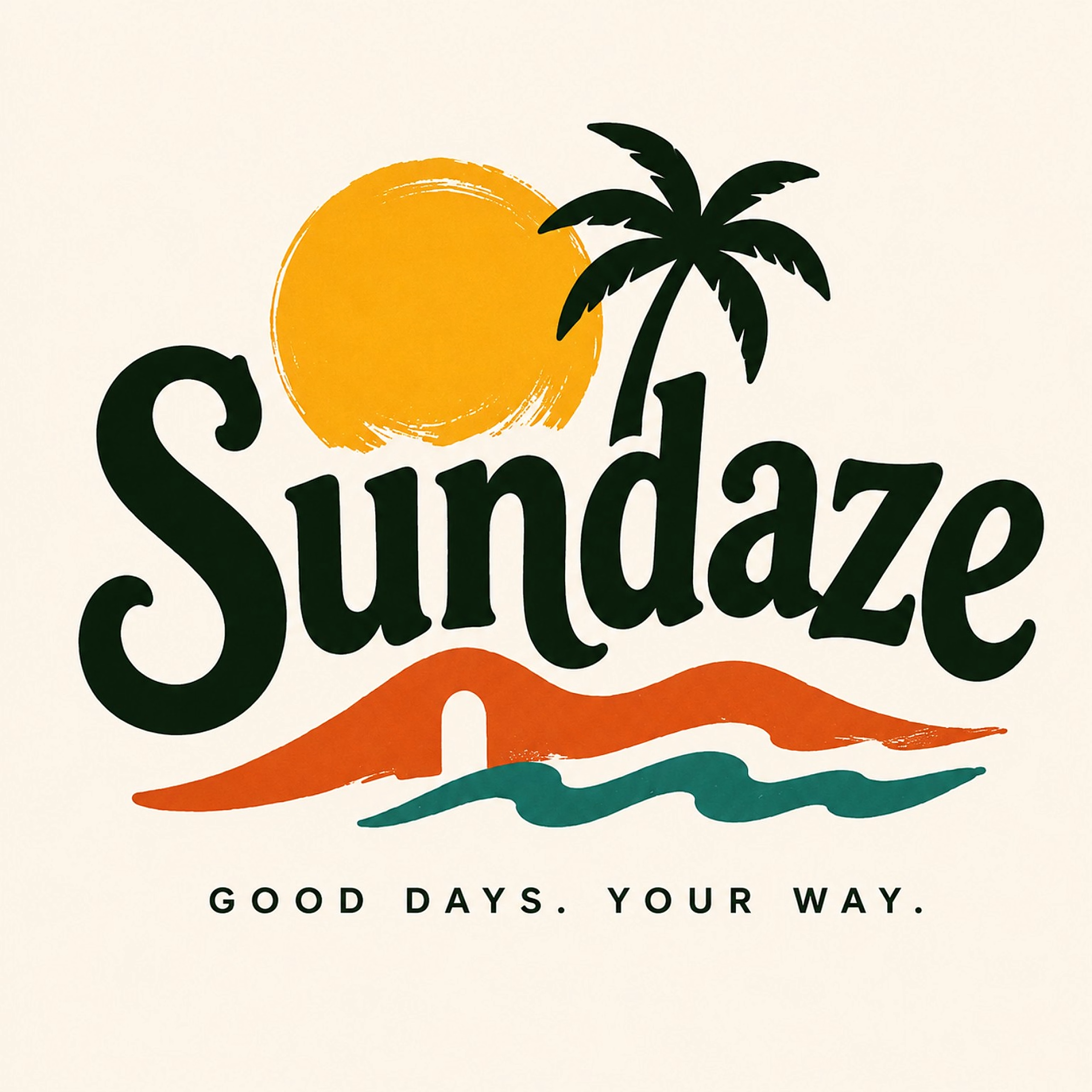
Take this fictional brand logo for example.
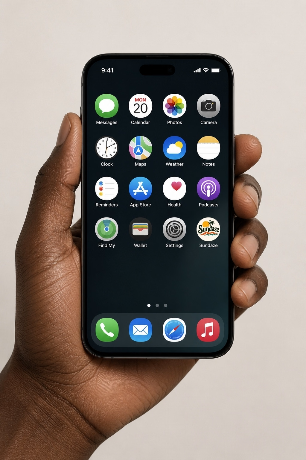
It will look good on any merch, and also on a big screen. But shrink it down to app icon size and it’ll be hard to find and difficult to recognise.
A logo that only works at one size isn’t doing its job. It’s just having a good day under very specific conditions.
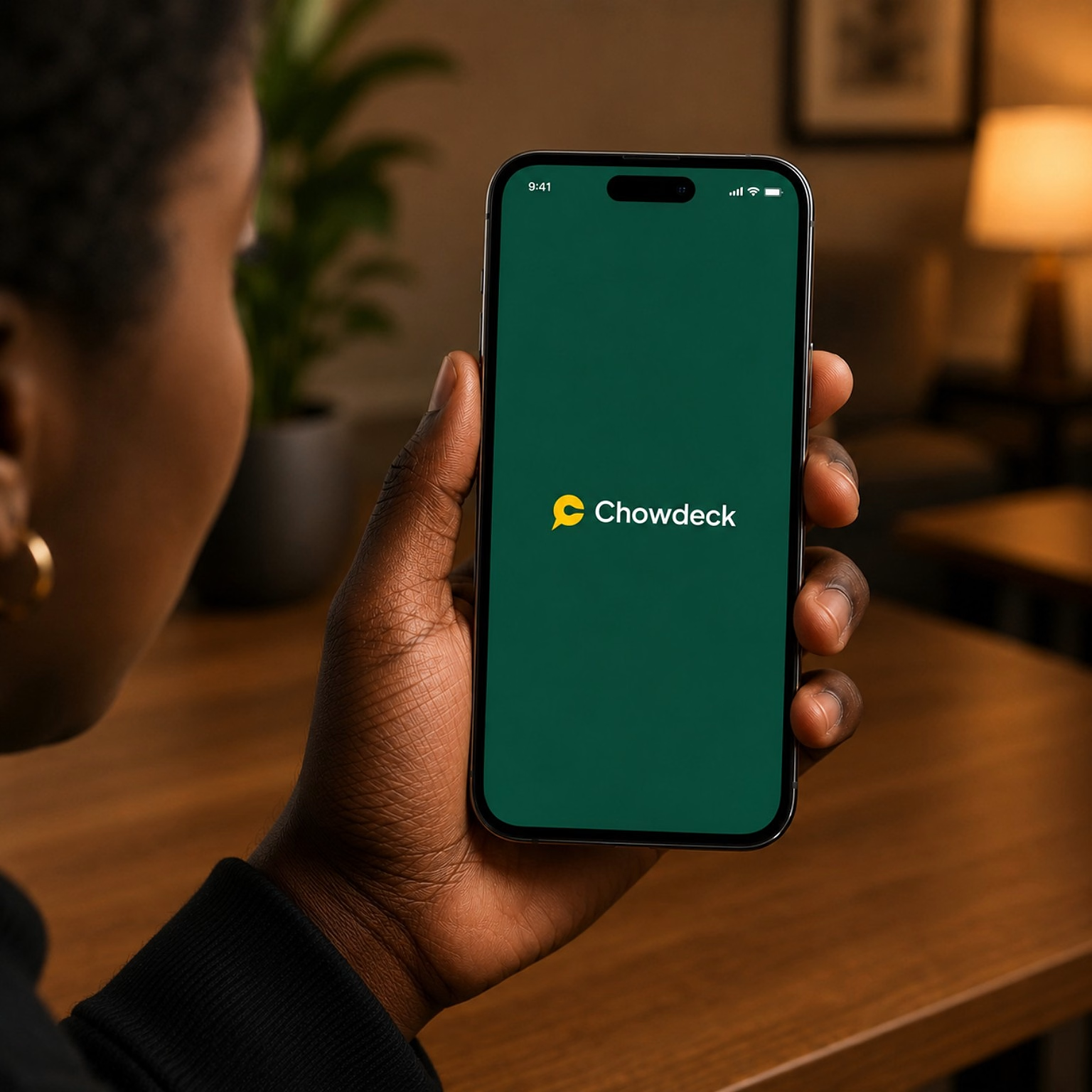
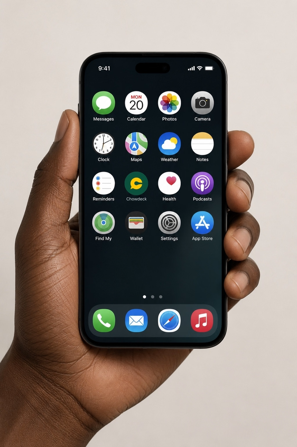
Now compare that to a brand like Chowdeck.
Whether it’s on a billboard, or as a tiny app icon, the logo works at any size.
That means if your logo needs its full size and full detail to make sense, it isn’t flexible enough for the way people see brands today.
That’s one important test for a logo.
Not just, “Does it look nice?” Ask “Does it still work when it’s tiny, on a plain background, or on a screen someone’s holding six inches from their face?” Because that’s how people actually see brands now. Mostly in small, quick glances on a phone.
At Toast Creative Studios, we design functional logos that are built to perform across every touchpoint.
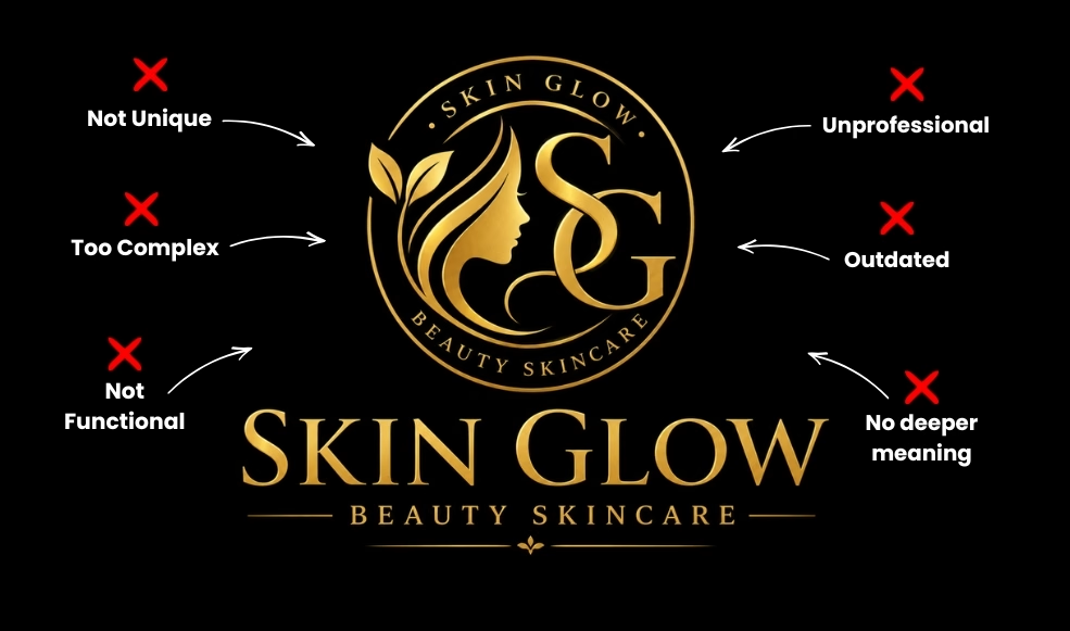
Let’s say you want to buy quality skincare products, and then you search on Instagram or TikTok and come across these two brands.
Who are you more likely to contact?
Probably the one that looks more professional.
Not necessarily because you know anything about the quality of their products or services, but because their logo has already created an impression.
You see a polished, well-designed logo and you subconsciously expect a polished, well-run business behind it.
On the other hand, if you see a logo that looks rushed, inconsistent or AI generated, fairly or unfairly, you may start to question the business itself.
Typically, your logo is one of the first points of contact people have with your business. It actually influences what they expect from you before they ever buy from you.
A good logo won’t magically make your business or products better of course, but bad logos can make good businesses or products look less credible than they really are.
So while your competitors are presenting themselves as professional, trustworthy and established, what is your logo saying about you?
Imagine you started a business selling office stationery.
Your first logo made sense. Maybe it had a pen, a pencil, or some little stationery icon because that was what you sold.
Then your business grew.
You started selling corporate shoes because, well, people need corporate shoes to wear to the office.
Then you added cupcakes because apparently, everyone needs a snack during a long workday.
Now you sell stationery, corporate shoes, and office snacks.
And let’s be honest, you definitely won’t stop there.
Next thing you know, you’ve added hampers, gift boxes, phone chargers, zobo, and three other things nobody saw coming. But your logo still has a giant biro on it.
Why?
At this point, are you a stationery brand that accidentally sells everything else? Or are you a brand created to serve corporate professionals in different ways?
As your business evolves, your logo should evolve with it. The identity that worked when you started may no longer represent where you are today.
Your logo should communicate the bigger picture of your brand, not just the first product you sold.
This is why a brand like Dunkin simplified their identity. As the business expanded beyond just Donuts, the logo needed to reflect that expansion.
Ultimately, a rebrand isn’t always about changing because something is wrong. Sometimes it’s about making sure your brand catches up with your business.
At Toast Creative Studios, we can help you create a logo that is strategic, memorable, and designed to stand the test of time.
Imagine you’re looking for a lawyer and you come across these two law firms online.
Which one would you trust with your case?
Your logo is one of the first things people use to judge what kind of business you are.
Before they read your website or speak to you, they’ve already formed an impression.
So, if your logo looks playful when your business is serious, or looks cheap when your service is premium, you’re sending mixed signals.
However, your logo doesn’t have to be literal or show what you do. I mean, is there anything about the Apple logo that tells you they sell phones? Or does the Nike logo tell you they make shoes?
Their logos don’t literally show those products. They just feel right.
That’s because their logos match the personality, positioning, and expectations of the brands behind them.
Your logo should do the same.
When customers are confused, they usually don’t ask questions.
Instead, they move on.
A good logo doesn’t make people guess. It creates the right impression, attracts the right audience, and helps people feel confident that they are in the right place. Bad logos do the exact opposite.
At Toast Creative Studios, every logo we create is backed by strategy, research, and a deep understanding of the business behind it.
If you’re curious about how we approach logo design from start to finish, read Our Step-by-Step Logo Design Process.
Bad logos don’t just affect how brands look. It can quietly affect the business revenue.
Every time someone mistakes you for a competitor, questions your credibility, or scrolls past your business because your logo doesn’t reflect the quality of your brand, you could be losing money without even realizing it.
The truth is, most business owners never realise their logo is part of the problem.
They assume slow growth, declining sales, or low revenue is caused by poor marketing, pricing, or competition.
Sometimes that’s true.
Other times, your logo is the very thing standing between your business and more revenue.