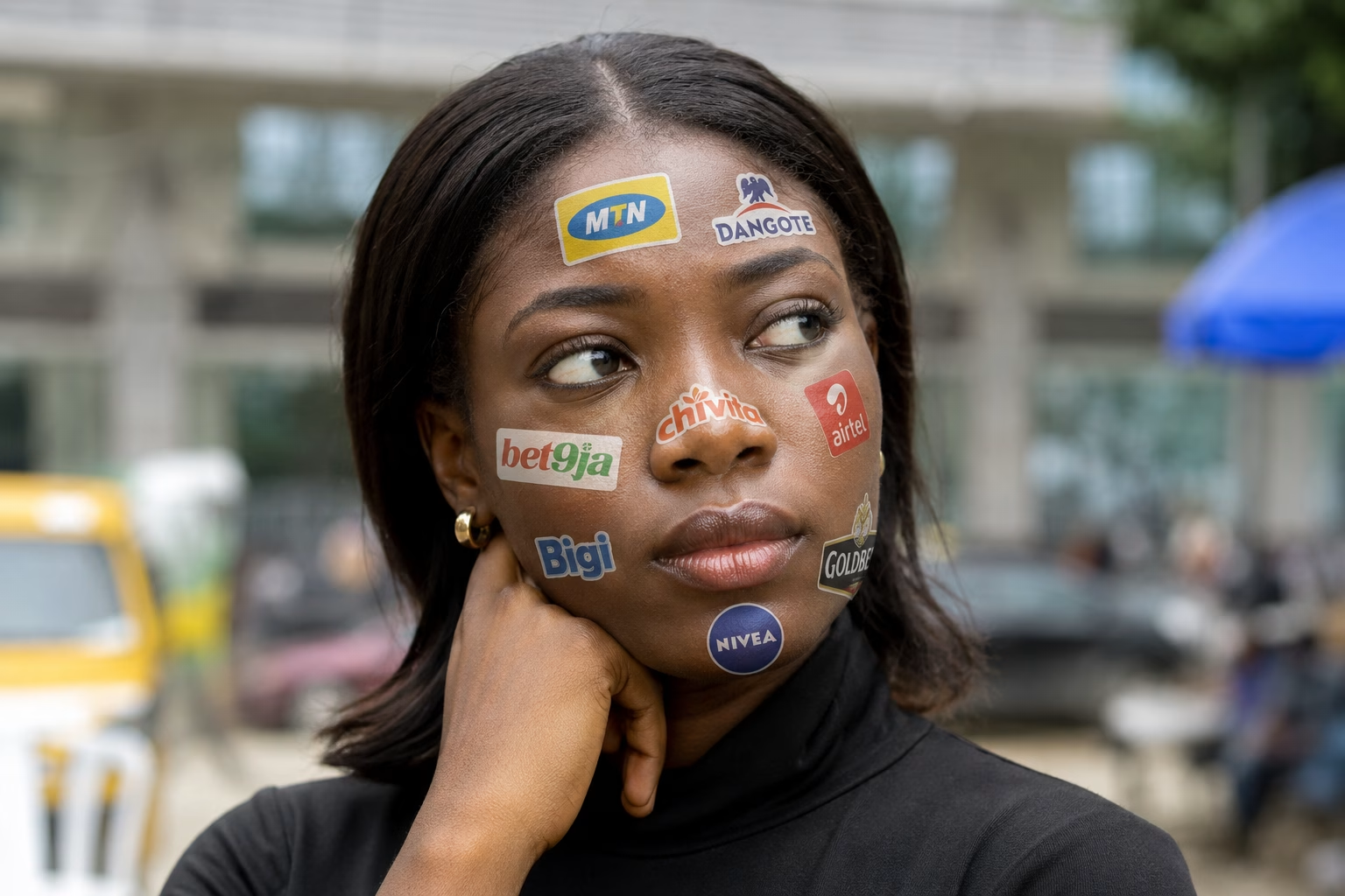
The last time you tried to look for a friend in the crowd, you didn’t look for their name floating above their head, you simply scanned the crowd for one thing: their face.
And when you spot it, recognition is instant; relief too.
That’s exactly what a logo is meant to do for a business.
A Logo’s primary job is to help people recognise your business. That’s it.
Not to advertise or explain your product or service offerings nor even impress people with fancy looking graphics.
In many ways, a logo is to a business what a face is to a person.
Written by Judith Okposia | Edited by Jide Awulonu
Think about it. A face doesn’t need to be conventionally beautiful to be memorable. It just needs to be recognisable, distinguishable, and consistent enough that people remember it the next time they see it.
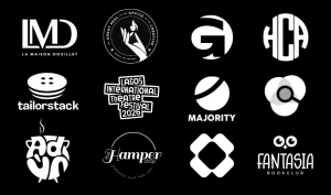
The same is true for logos. The best logos aren’t necessarily the prettiest ones but they’re easily recognisable, regardless of shape, size & where they are placed — printed on a tiny pen, sitting in the corner of a website, or stretched across the side of a building.
So, if we’re saying a logo equals the face of a business, the question becomes: What makes a face (logo) memorable in the first place?
If Burnaboy waved at you from a distance in the market, chances are you will recognise him before you could make out every detail on his face. Why?

That’s because a face doesn’t rely on up-close details to be identifiable. Its overall shape and distinctive features do the heavy lifting.
A logo should work the same way.
If your logo only looks good when it’s large on your laptop screen but becomes an unrecognisable blur on the side of a pen, a bottle cap, a website favicon, or a social media profile picture, it isn’t doing its job.
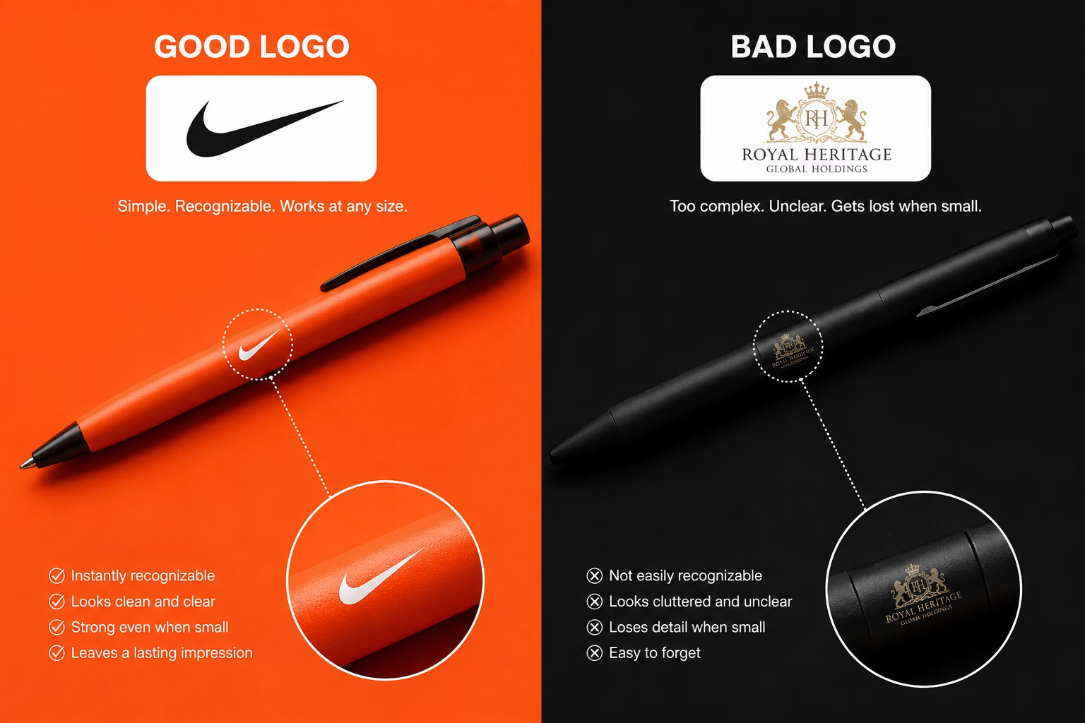
A great logo should be just as recognisable on a business card as it is on a billboard. It should survive being shrunk, embroidered, engraved, stamped, or printed in black and white without losing what makes it unmistakably yours.
If people have to squint to figure out who you are, your logo isn’t working nearly as hard as it should.
So take a few steps away from your logo and look at it again, can you see it clearly? Or do you have to squint?
Imagine meeting someone whose face is covered in glitter, dramatic face paint, oversized sunglasses, a hat pulled over their eyes, or a giant fake moustache.
Sure, they’d get your attention. But would you remember what they actually looked like 5 mins after meeting them? Probably not.
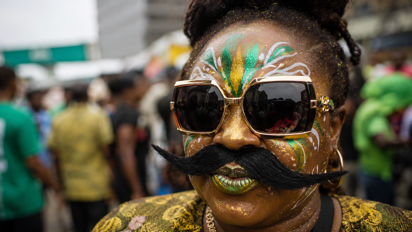
When there’s too much going on, our brains have to work harder to separate what’s important from what’s just decoration. The same thing happens with logos.
It’s tempting to add more because every detail feels meaningful. A leaf to represent growth. A globe to show you’re international. A handshake for trust. A crown for excellence. Before long, you’ve designed a logo that tries to tell your entire brand story in one tiny mark.
The problem? Your Logo’s job isn’t to explain but to help people recognise you.
If both brands served excellent wines, which of these brands are you most likely to remember 2 weeks after the first sip?
A simple logo is easier to spot, remember, and easier to reproduce across everything from your Instagram profile picture to your product packaging.
Here’s a simple test we like to use at Toast:
Can you sketch your logo with a pencil in four seconds or less?
If the answer is yes, you’ve probably got something memorable
If not, it might be time to go back to the drawing board.
At Toast Creative Studios, we’ve created “The Baby CEO’s Guide to Branding” to give founders the tools they need to build their brands from scratch. And It’s Free!
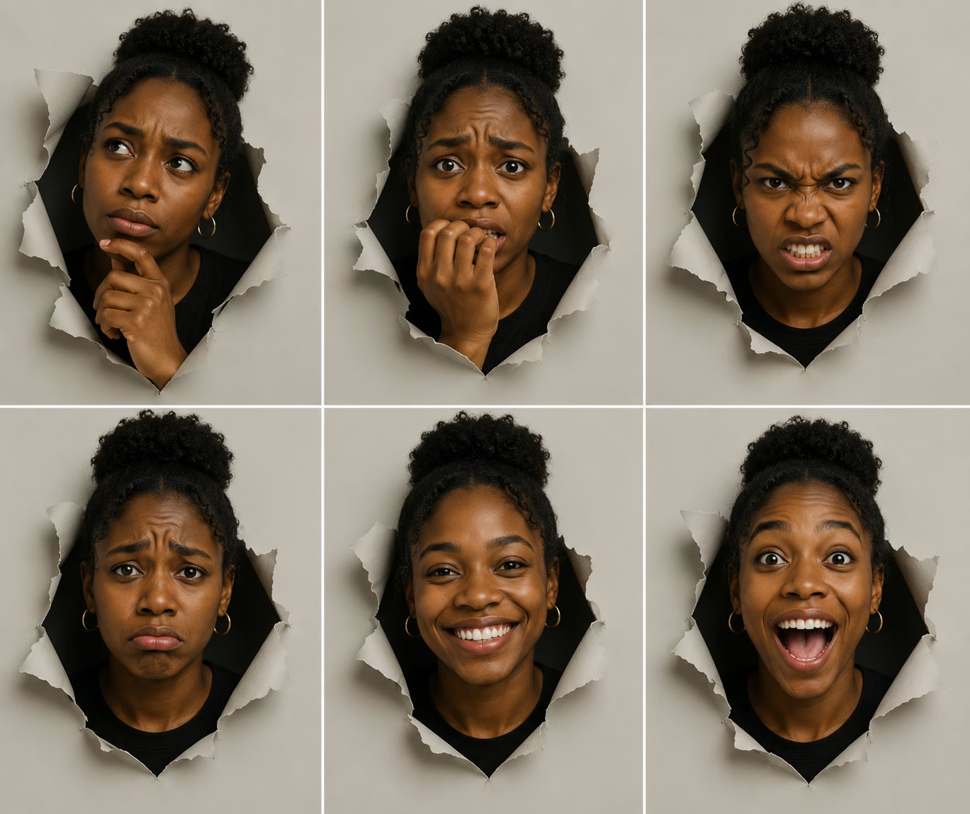
Have you ever walked on the road and one stranger just says to you; ‘Uncle, smile now. Life nor hard like that.’ You chuckle and move on. It points to one thing, before someone says a single word, their face has already started telling you a story.
A smile can make someone feel approachable.
Furrowed brows can signal deep thought.
Bright eyes can communicate excitement.
Even the way someone carries their expression shapes the first impression you form about them.
Of course, a face can’t tell you everything about a person. But it tells you enough to begin building a picture of who they are. A logo should do the same.
It shouldn’t try to explain everything about your business—that’s the job of your products, your messaging, and your customer experience. But it should reflect something true about your brand. Something that gives the symbol meaning beyond its shape.
That’s why the logo design process at Toast Creative Studios always starts with questions.
Why does this business exist?
What does the founder believe?
What problem are they trying to solve?
What kind of change do they want to make?
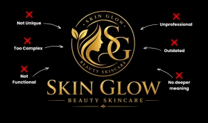
Which of these beauty salons do you think you’d find Shea butter in? See what we are saying??
The answers to those questions become the story that shapes the logo.
Without that foundation, a logo is just a collection of lines and curves. It might look nice, but it could belong to almost anyone.
When a logo is rooted in a genuine story, however, every design decision becomes intentional.
The symbol isn’t memorable just because it’s distinctivem, it becomes memorable because it stands for something true to the business.
So, is your logo just a shape or can we boast of the story?
At Toast, we help businesses uncover the story behind their brand before we ever put pen to paper.

Think about your mum. If someone described your mum as having two eyes, a nose, a mouth, and black hair, would you agree that’s your mum? Of course not. Those are features millions of people share.
What makes your mum instantly recognisable isn’t any one feature on its own. It’s the unique combination of all of them. The shape of her face, her smile, the way her eyes sit, and the little details your brain has learned to recognise over time. That’s what makes her unmistakably her.
A logo works the same way. By themselves, circles aren’t unique, neither are leaves, shields, crowns, arrows, mountains, or light bulbs, they’re just what we call visual elements.
The magic happens in how those elements come together to create something people can immediately associate with your business and no one else’s.
Unfortunately, many businesses start their logo journey by looking at what everyone else in their industry is doing.
A coffee brand uses a coffee bean because every coffee brand uses a coffee bean.
A real estate company chooses a rooftop.
A skincare brand chooses a body outline.
Before long, every business begins to resemble its competitors instead of standing apart from them.
Google “coffee brand logos.” You get $1 for every logo that’s similar to the ones above. Which one made you a millionaire?
The irony is that businesses copy others because they want to fit into their industry. But in doing so, they become harder to recognise. But, what makes a memorable logo is that it belongs only to you.
That’s why uniqueness isn’t about being strange, or different for the sake of it. It’s about creating a visual identity that’s so closely tied to your brand that, over time, people stop seeing a symbol and start seeing you.
In other words, the recognition of your logo only works when people can tell you apart.

Wrong answers only – What do you think this guy does for a living?
Any guess you made could be 100% right, after all, you can’t tell a person’s job by looking at their face. You can only guess.
We don’t expect a doctor’s face to have a stethoscope printed on it. We don’t expect an architect to have tiny buildings drawn on their forehead. We recognise people first, then learn what they do through conversation and experience.
A logo should work the same way.
One of the most common mistakes businesses make is trying to turn their logo into a billboard advert.
A bakery adds bread
a logistics company adds a truck
and a cleaning company adds bubbles and a mop.
The intention behind it? “If people can see what we sell, they’ll understand our business immediately.”
But that’s the problem. If everyone in your industry uses the same literal symbols, those symbols stop helping people recognise you.
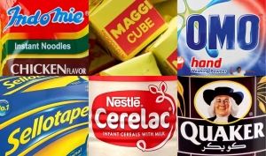
Think about Nike for a second, the Swoosh doesn’t look like a shoe nor does Apple’s logo look like a phone, yet millions of people can identify those brands instantly. Why? Because recognition is built through distinctiveness and repeated association, not through literal illustration.
In fact, the more literal a logo becomes, the more likely it is to blend into a sea of competitors using the exact same visual shortcuts.
A wine logo made of grapes might communicate “wine” quickly, but it may do very little to communicate your wine brand.
A memorable logo asks “What symbol can become unmistakably associated with my business over time?”
not
“What picture best describes my product?”
That’s the same reason a face works. It doesn’t need to explain your profession to be valuable.
Its job is simpler and far more powerful: to make you instantly recognisable the moment someone sees you.
By now, you’ve probably noticed the pattern, that great logos don’t start with colours, fonts, or sketchbooks. They start with clarity.
A business that understands who it is, what it stands for, and the impression it wants to leave is already halfway to creating a memorable logo. The design simply becomes the visual expression of that clarity.
Need help finding brand clarity? We wrote an essential branding checklist just for you. Check it out
Just like a face, the best logos aren’t the most beautiful ones.
The best logos are the ones that are simple enough to recall, functional enough to work anywhere, unique enough to stand out, meaningful enough to tell a story, and confident enough to not have to explain everything literally.
Do you agree with our breakdown? What else do you consider when you judge a logo??