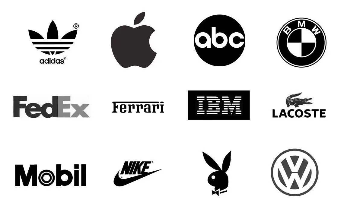
A logo is the symbolic representation of a brand, made with colours, texts, shapes and images. It is essentially the face of a company as it functions primarily as an identifier. When you see a logo you are familiar with, you instantly associate it with your memories, experiences, and interactions with the brand.
Now that we know what a logo is, let’s explore its types:
The Wordmark: It is a collection of alphabets and/or figures which directly states the name of the brand or product. It is easy to recollect and might even be easy to design. Examples are NETFLIX and COCA-COLA. Typography determines how a Wordmark logo would look. You want to choose a typeface that would suit the brand or hand-draw one from scratch. For example, Disney’s typography implies fun while Google’s is more formal.
The Lettermark: Unlike the Wordmark, the Lettermark does not just spell out the brand name, it instead incorporates letters into the design. These letters are usually the initials of the company. Logos designed using the Lettermark are simple and always easy to remember. Examples are CNN, HP, LV, ESPN
Pictorial: This type is made up of icons and symbols that are representations of everyday images. These symbols could represent the company’s names directly like Apple, Target or Shell or indirectly like Lacoste which signifies a crocodile, the nickname of the founder Rene Lacoste.
Abstract Iconography: Although similar to Pictorial, the icons and symbols used here are not representations of everyday images. They are rather abstract concepts created from scratch to depict what the brand represents. This gives a unique and symbolic representation of the brand. Examples are Pepsi, Nike, Microsoft, Olympics.
Emblem: The Emblem is designed by putting words inside a symbol, something like the badges or stamps we have. This is well associated with automobiles and sports teams. Examples are Arsenal, BMW, Superman and Ford logos.
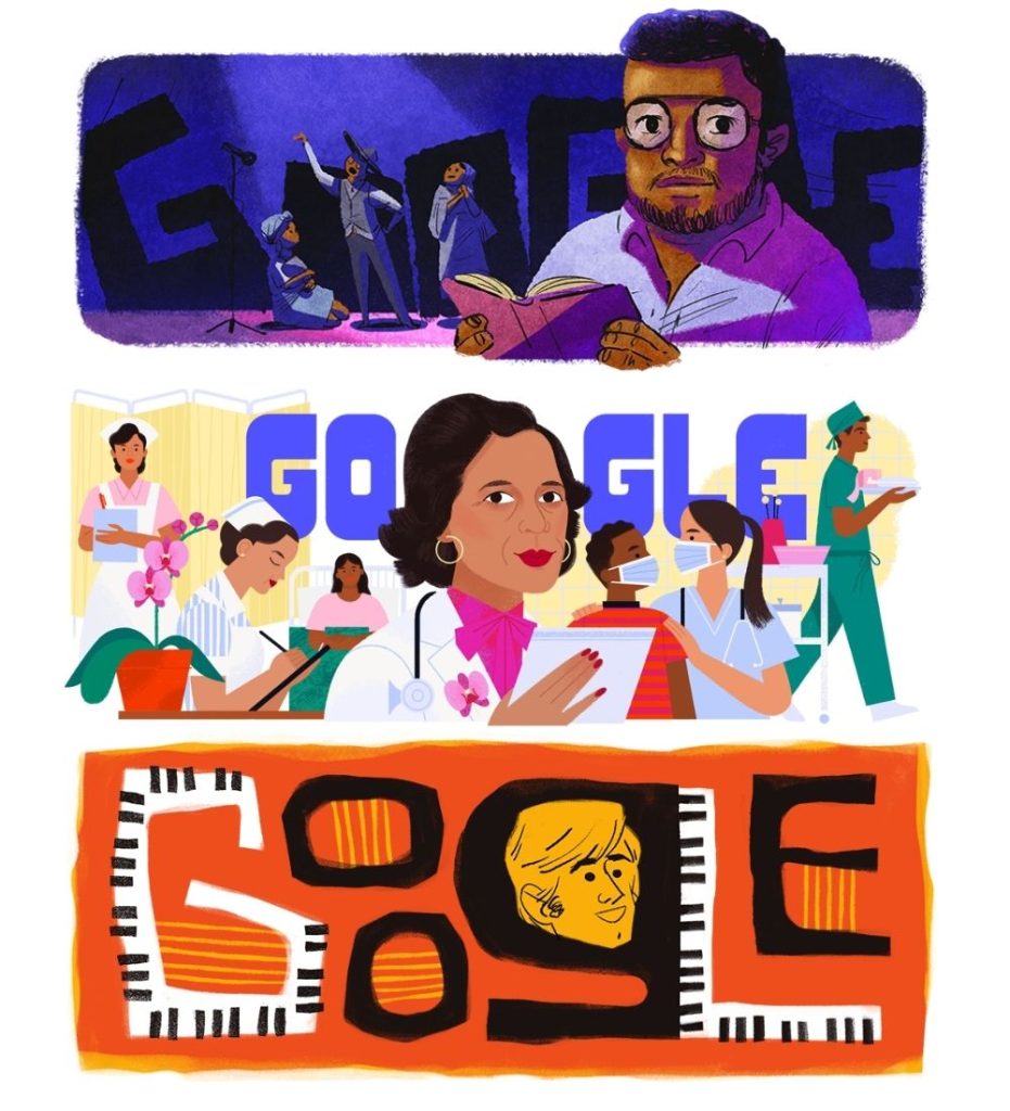
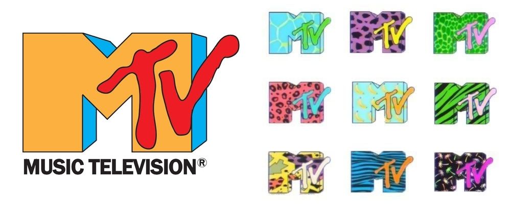
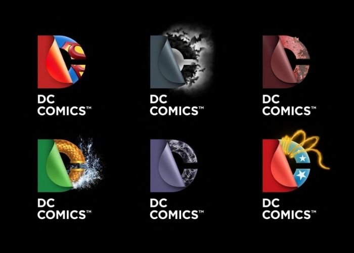
The Logo System: This type uses all the elements of the aforementioned types of logo and there is no boundary to it, as it uses every colour, shape, figure and image. It is not confined to just an element but uses each dynamically in a single design. The logo system is therefore loved by design enthusiasts as it is a typical depiction of the ever-changing world of design and technology. Examples are Google Doodle, MTV, DC and Hilary Clinton’s campaign logo.
If your answers to these questions are yes, then bravo! Your logo has been designed well.
Looking to brand your company and build a logo? Hire us. At Toast Creative Studios, we are particular about good design, we would love it if you check out our work and follow us on Instagram.
One Response
A beautifully written, educative piece.