You know what a logo is. You know it is supposed to represent a brand. You probably even know a good logo when you see one.
But do you know what goes into designing one?
Written by Amanda Benson | Edited by Jide Awulonu
Contrary to popular belief, a logo design process doesn’t just involve opening your design app, picking a nice font, adding a shape and calling it a day. Some designers do this, and if you choose to work with them, good luck! Body go tell you! 😂
A good logo starts long before the first line is drawn. There is an entire design thinking process behind it.
In this article, you will be getting a sneak peek into our top secret design process that has helped us build over 100 logos for businesses like yours in Nigeria and around the world.
Let’s dive right in:
Step One: Brand deep dive (4 - 6 days)
Before we design anything, we need to understand the business we are designing for.
It all starts with questions.
Lots and lots of questions.
What does the brand do?
Who is it for?
What does the brand want to be known for?
Where is the business now, and where does it want to go in the next 5 years?
What makes it different?
What should people feel when they interact with it?
Sometimes, the answers are obvious. Sometimes, they lead to more questions. Either way, the goal is the same: understand the brand well enough to make design decisions that actually mean something.
After all, you cannot represent something you do not fully understand.
Quick test: What 3 things should someone understand about your brand, after interacting with it for 30 seconds? Answer in the comments
Does your brand need more clarity?
At Toast Creative Studios, we ask the questions that help uncover what makes your brand different.
Now that we fully understand the brand, it’s time to simplify.
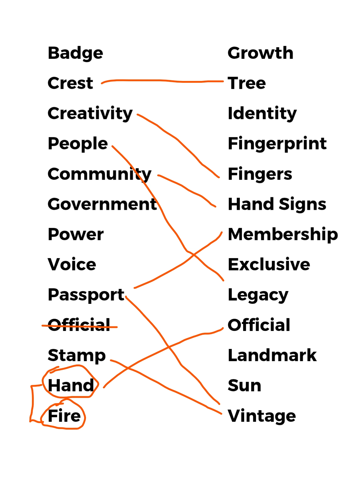
Word associations help us distill hours of conversations into a list of more than 20 simple words. Each word must connect to the brand in one way or another.
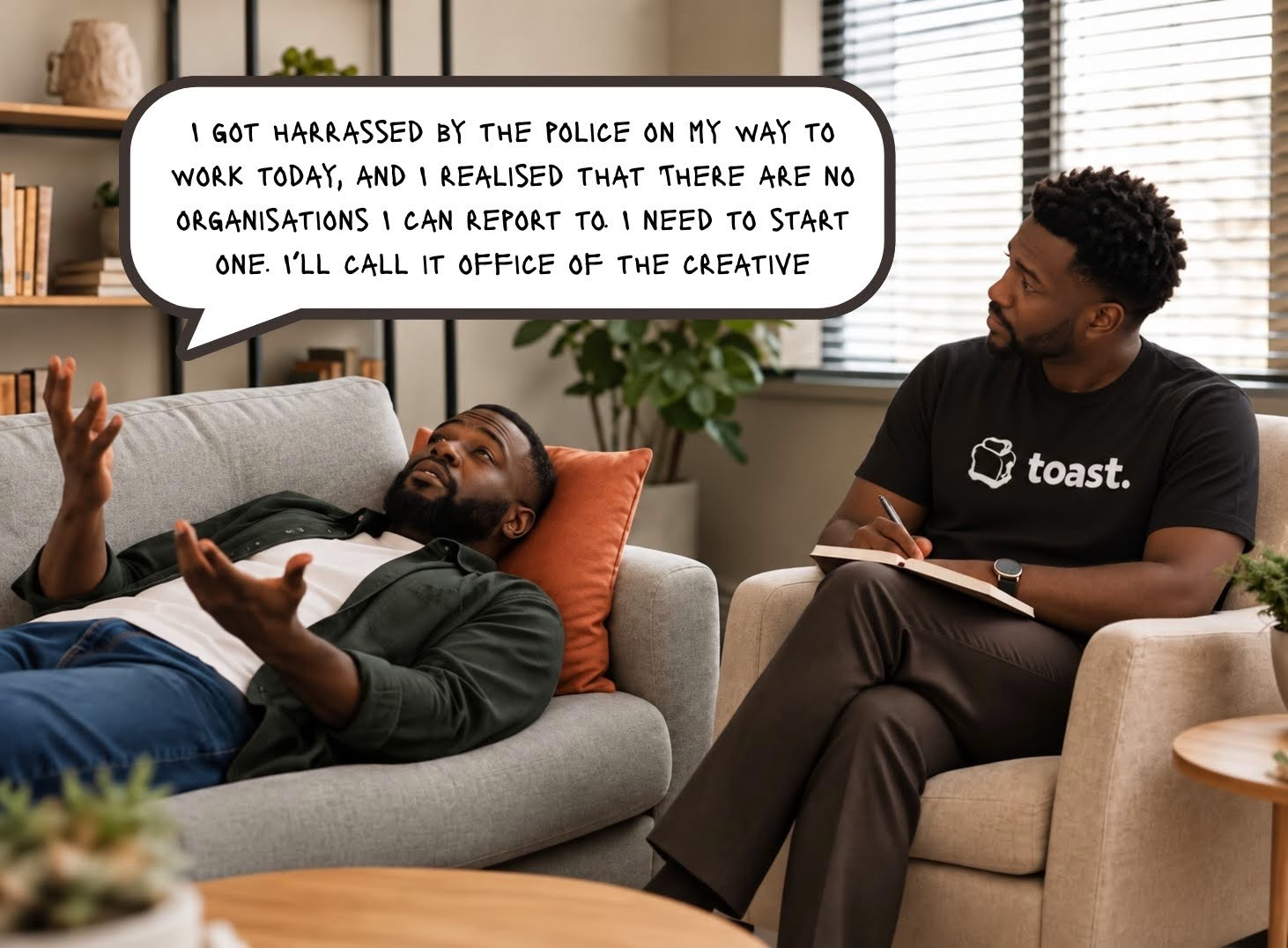
See below our word association list for The Office of The Creative.
Once we have our word association list, it becomes the foundation for all the visual ideas we would explore in this logo design process.
Quick test: Write down 20 words associated with your brand.
Step Three: Moodboarding (3 - 4 days)
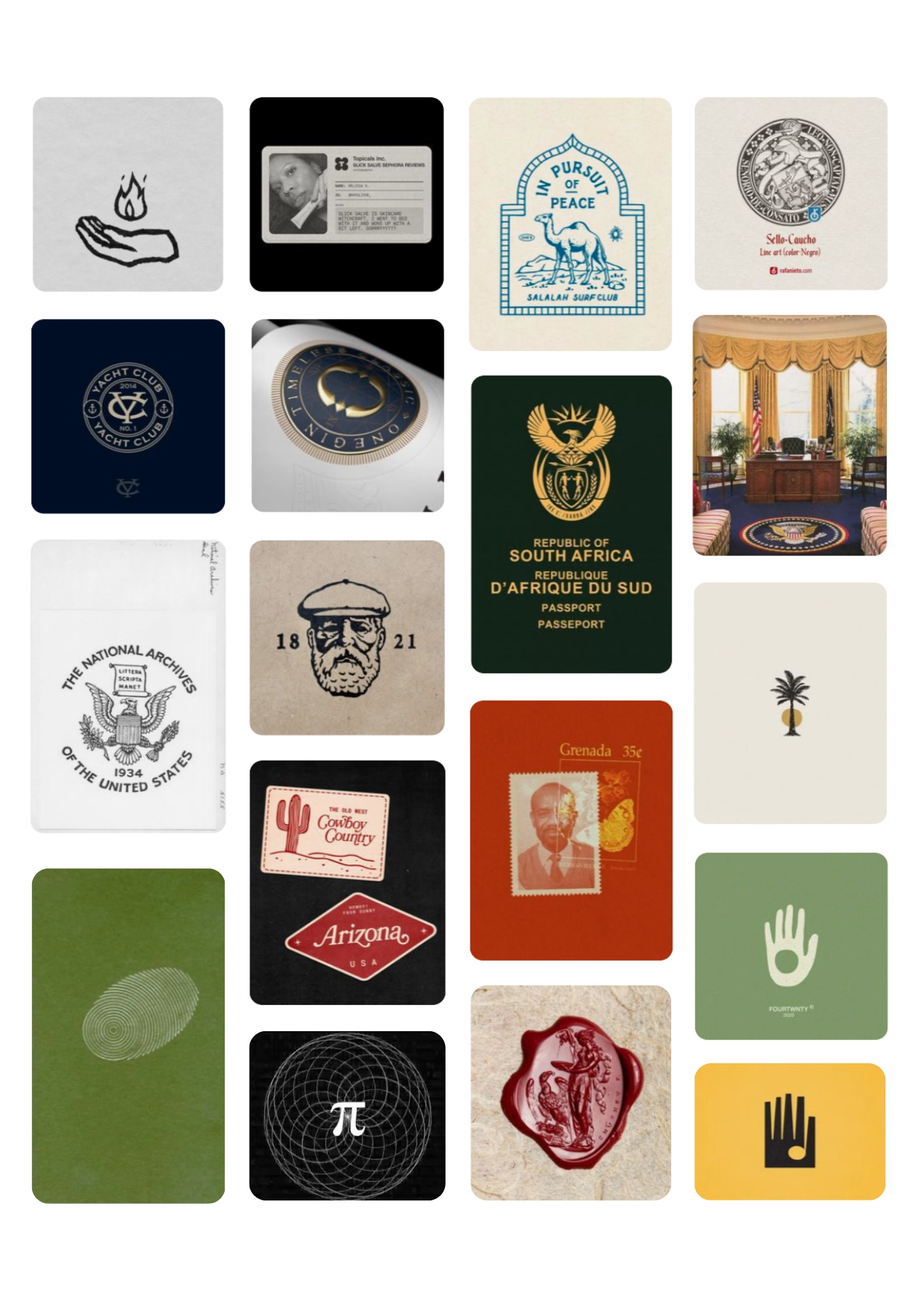
Next comes the moodboard.
And no, it is not just a collection of pretty pictures we found on Pinterest.
The moodboard is built from the ideas we uncovered during the word association stage. It helps us explore the visual world the brand could live in.
We look at things like imagery, typography, shapes, textures, colours and overall visual direction.
The goal is not to copy what we see. It is to identify a visual language we can build on.
By this point, we are starting to see the brand take shape before the logo itself even exists.
Quick test: What kind of images will be part of your brand’s moodboard? Does your logo fit into it? Answer in the comments
Step Four: Sketching (6 - 8 days)
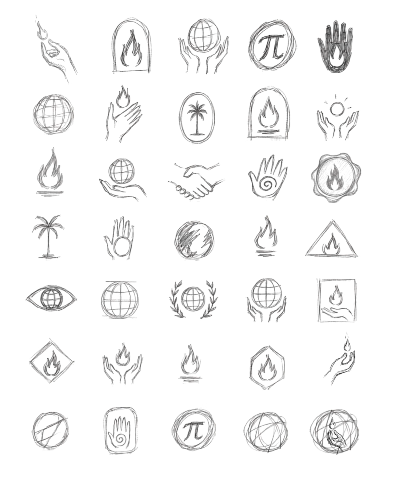
Now we finally pick up the pencil.
This is where the ideas start to take actual forms.
We sketch over a hundred different possibilities, play with shapes, combine elements and see how the ideas from the moodboard could translate into a logo.
Some sketches are promising.
Some are very much not.
That is part of the process.
Sketching allows us to explore quickly without getting too attached to any one idea. We can try something, look at it, decide it is not quite there and try again.
The goal at this stage is exploration, not perfection.
Quick test: How many did sketches did you create for your brand logo? Or did you even sketch at all? Let us know in the comments 😄
Let’s give your brand a visual language.
At Toast Creative Studios, we translate what your brand stands for into a visual direction that feels intentional.
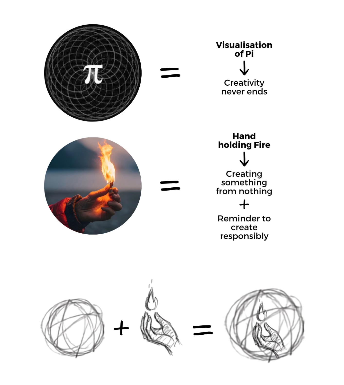
At this point, we have explored the brand conceptually, functionally and visually through word association, moodboarding and sketching. Now, we take the most promising direction and refine the concept behind it.
For the Office of The Creative, see our most promising concept defined below
This stage is important because a logo should not just be a collection of things that look nice together.
There should be a reason behind every decisions.
At this stage of the logo design process, we are connecting the visual elements back to the brand and making sure the concept actually represents something.
Quick test: Do you logo elements mean anything? Or are they just for decoration? Answer in the comments
Step Six: Vectorization (1 - 2 days)
The chosen sketch now moves from paper to screen.
We start by vectorising the concept, refining the shapes and proportions so the logo works as a clean, scalable mark. We first establish the logo in black and white, which lets us focus on the form before introducing colour.
Typography is considered alongside the mark, but it has its own process. We explore typefaces, spacing, proportions and alignment to find what works with the logo and the character of the brand.
Then we develop the colour palette. Colour is chosen with the brand in mind, not simply because a particular shade looks good. It should support the brand’s personality, audience and positioning.
For the Office of the Creative identity, for example, we used green and gold to communicate a sense of belonging, authority and connection.
Quick test: Were your brand colours chosen intentionally, or are they just your favorite colours? Answer in the comments
Step Seven: Final Logo Test (1 - 2 days)
After vectorization, we have to answer the following questions:
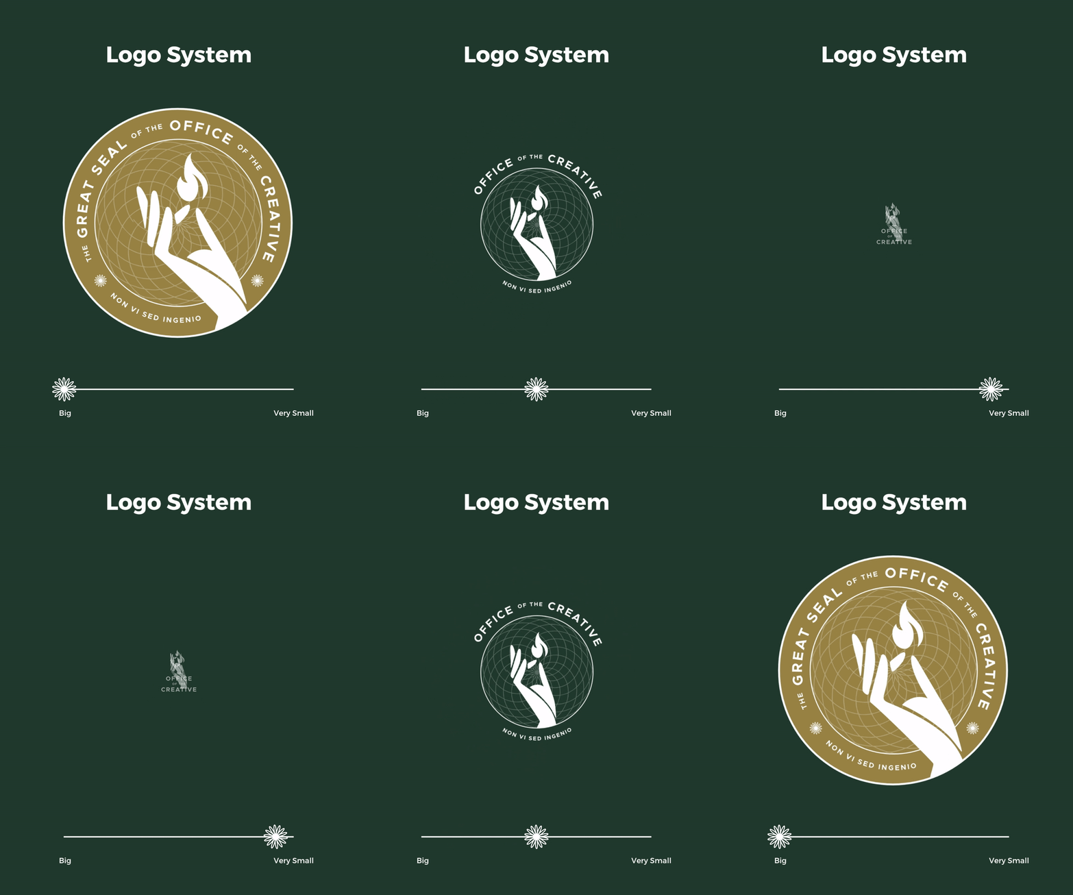
Does it work at different sizes?
Does it work in different applications?
Does it look good in black and white?
Does the typography work with the logo?
Is the identity consistent across different touchpoints?
We refine what needs refining and make sure the final system is practical, not just beautiful.
Quick test: Does your logo pass all the questions we just asked?
Step Eight: Brand system (72hrs)
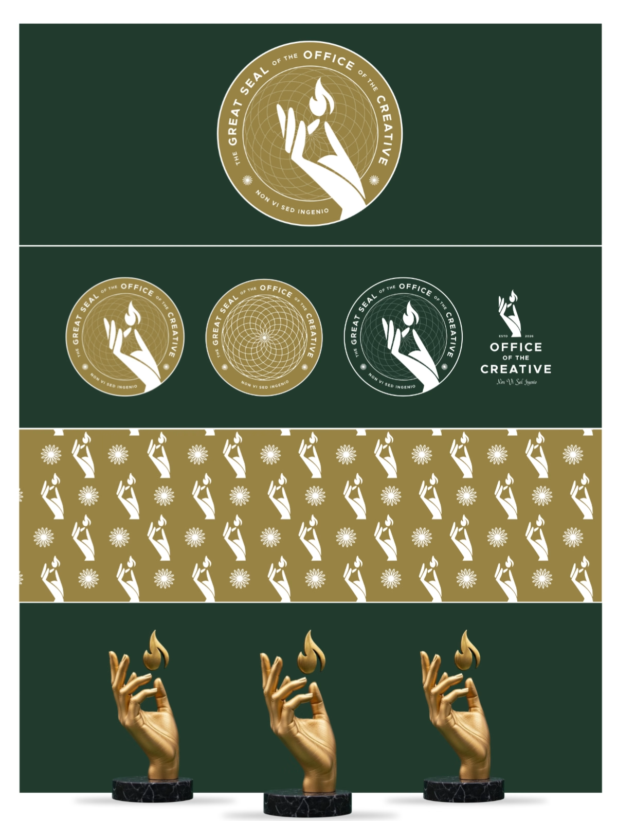
A logo can look great sitting by itself on a white or solid background, but it does not live on a white background.
It lives on websites, social media, packaging, documents, signage, products and everywhere else your brand shows up.
That is why we build a brand system around the logo, to show our clients all the different ways the logo works in practice.
So, if you have ever wanted to design a logo for your brand and thought, “The design should take a day, is it not just a logo?” Now you know better.
A good logo is the result of understanding, research, exploration, strategy and a lot of design decisions that you may never notice when you finally see the finished product.
And that is the point.
And if you want to see this entire logo design process in action, tap play
At Toast Creative Studios,we help businesses build visual identities that stay consistent across websites, social media, packaging and every other place your brand shows up.